Fine Lines, Bold Impact
Collas Crill — Brand Evolution & Visual Identity System
Collas Crill engaged HB to evolve their brand — not to start again, but to refine and strengthen what already existed. As Design Director, I led the creative direction for the project, working closely with the client through brand and tone-of-voice workshops to reinvigorate the identity while staying true to who they are and how they work.
-
Design Director
-
Brand evolution · Creative direction · Visual systems · Typography · Colour
-
2025
The brief
Collas Crill’s brand audit highlighted a number of challenges. While the brand was well respected, its visual expression felt tired and inconsistent. The existing colour palette, including the signature Collas Crill pink, had lost its impact. Collateral was eclectic and lacked cohesion, and functional typography offered little personality or distinction.
The brief was clear: evolve the brand without starting from scratch, retain existing equity, and create a more confident, consistent and contemporary expression — with particular emphasis on how the brand showed up across its outputs and day-to-day communications.
The thinking — Fine Lines, Bold Impact
Through workshops and tone-of-voice sessions, a clear picture emerged. Collas Crill wanted to be seen as knowledge experts with a personal touch — hands-on partners who work directly with clients, confident in their expertise but uninterested in competing with the biggest firms on scale alone.
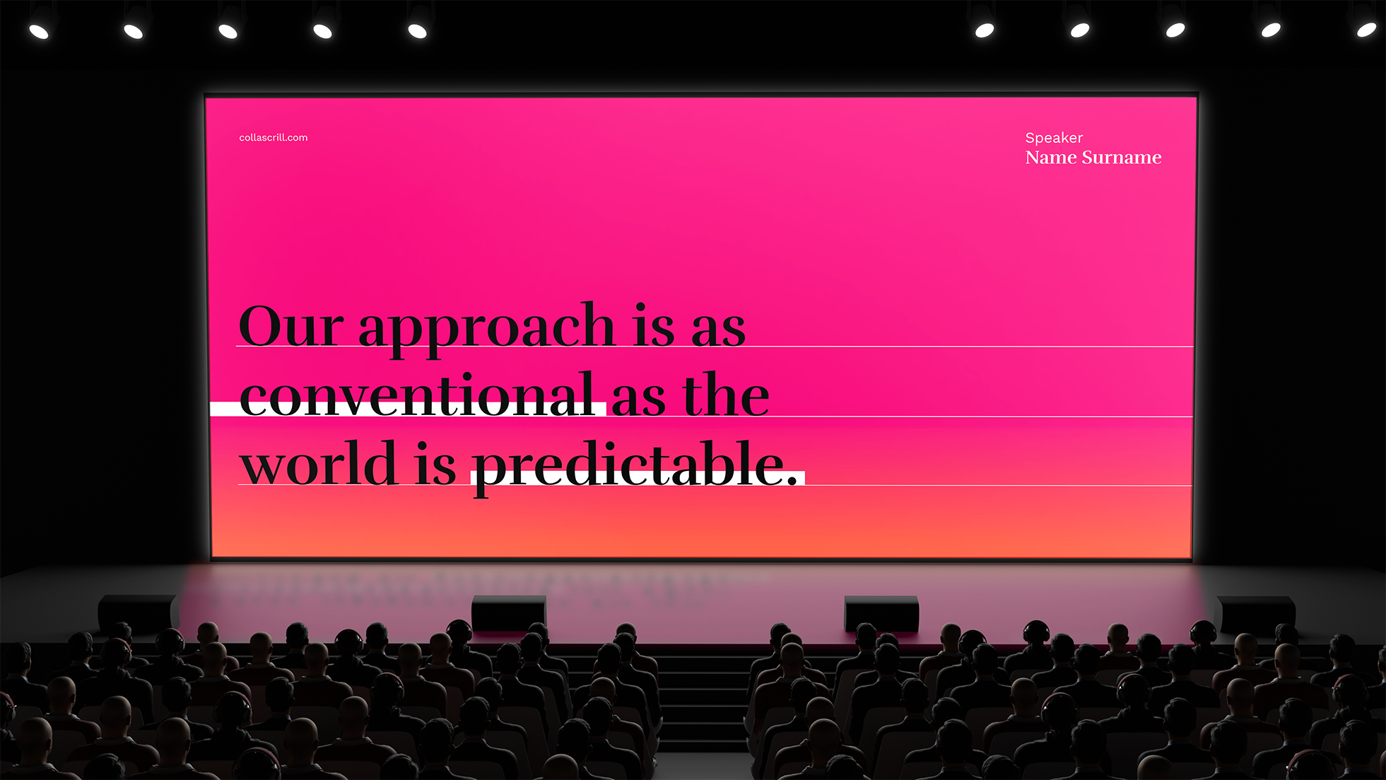
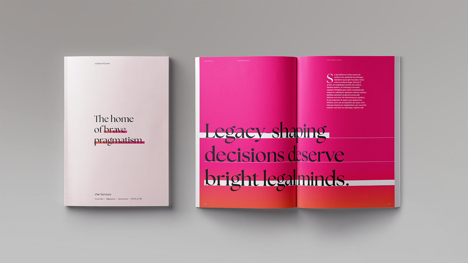
The organising idea, Fine Lines, Bold Impact, was born from this insight. It reflects the belief that Collas Crill’s strength lies in the detail — the work done in the margins between winning and losing, where expertise, precision and partnership make the difference.
This idea became the foundation for the visual system and brand expression.
A refined and flexible visual system
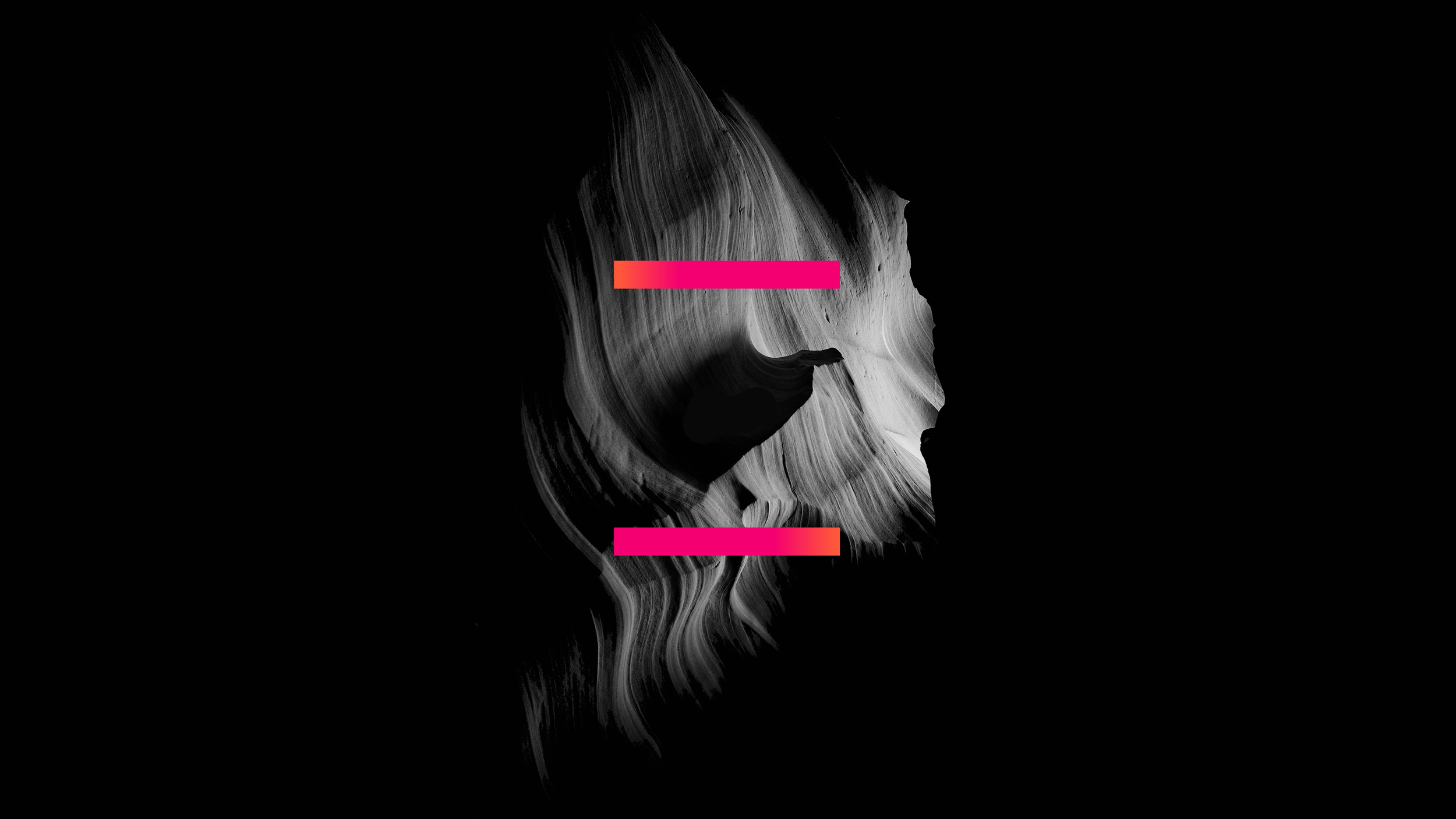
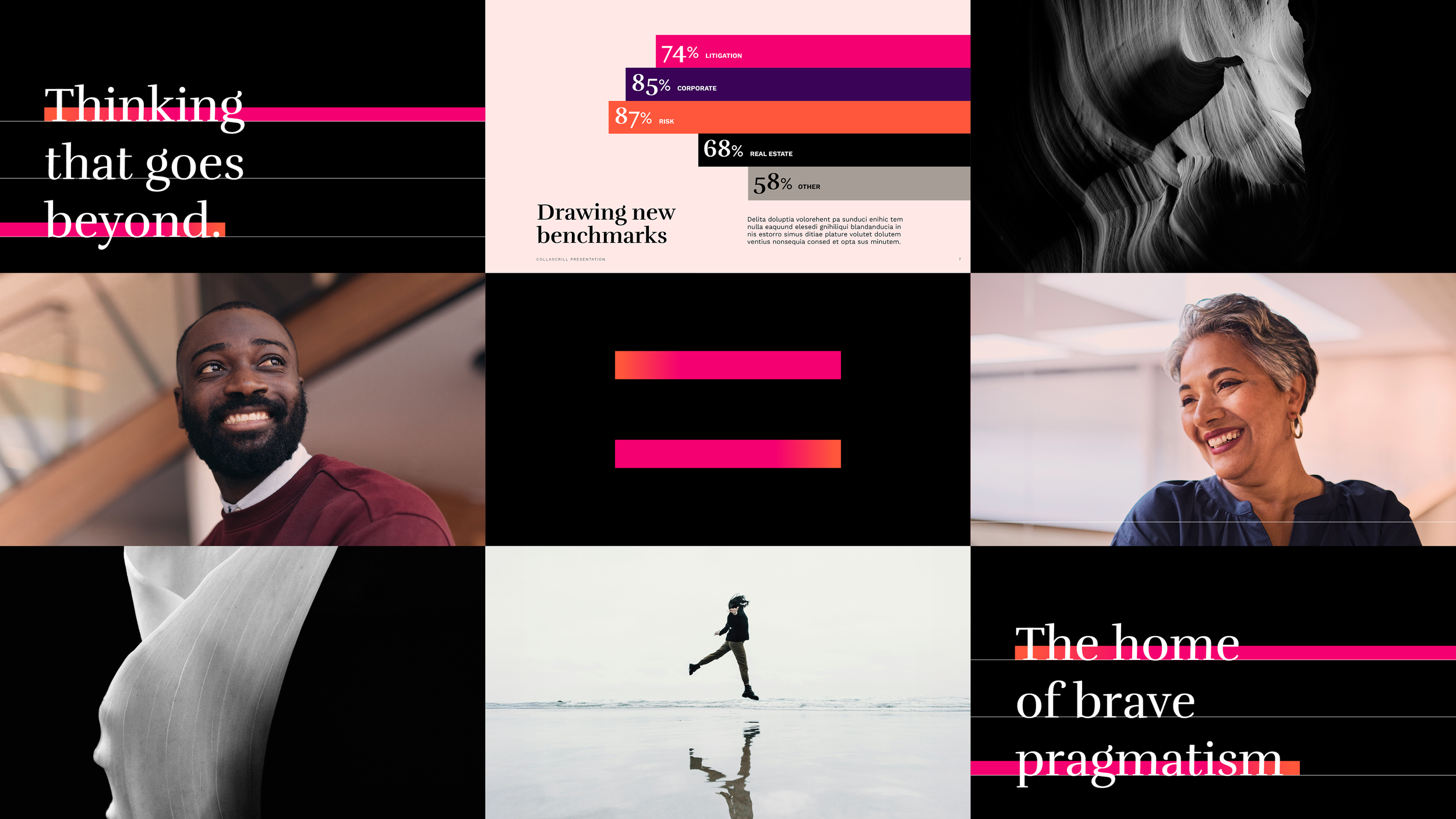
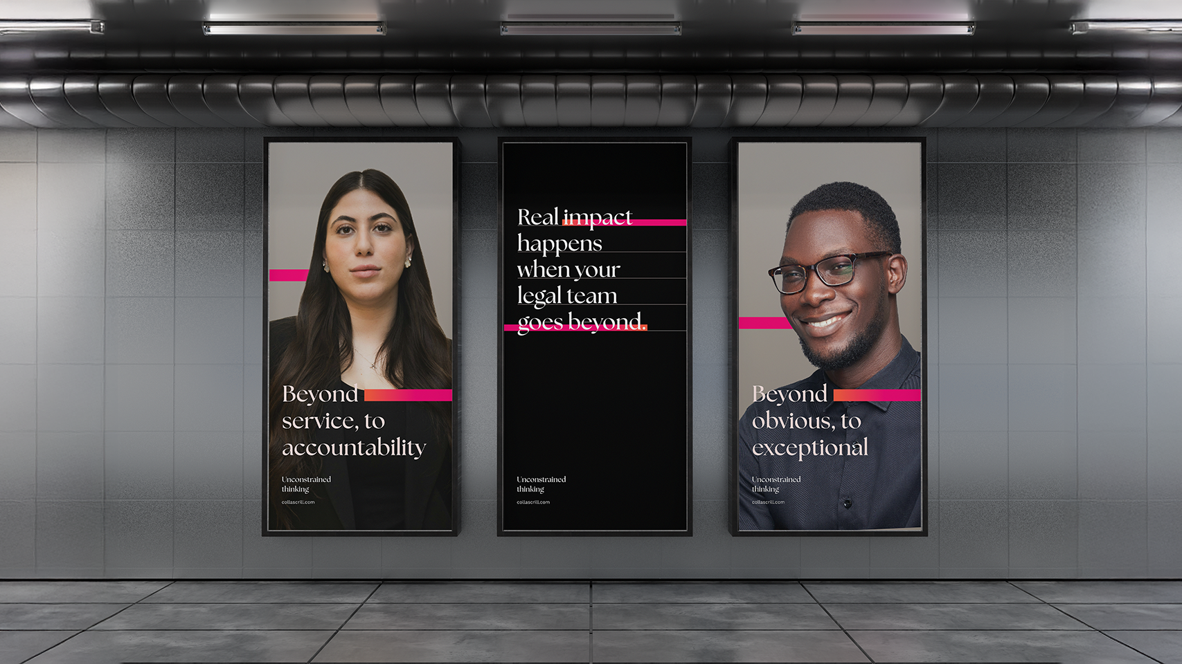
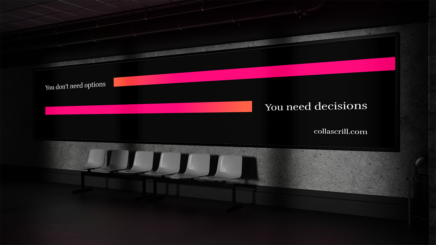
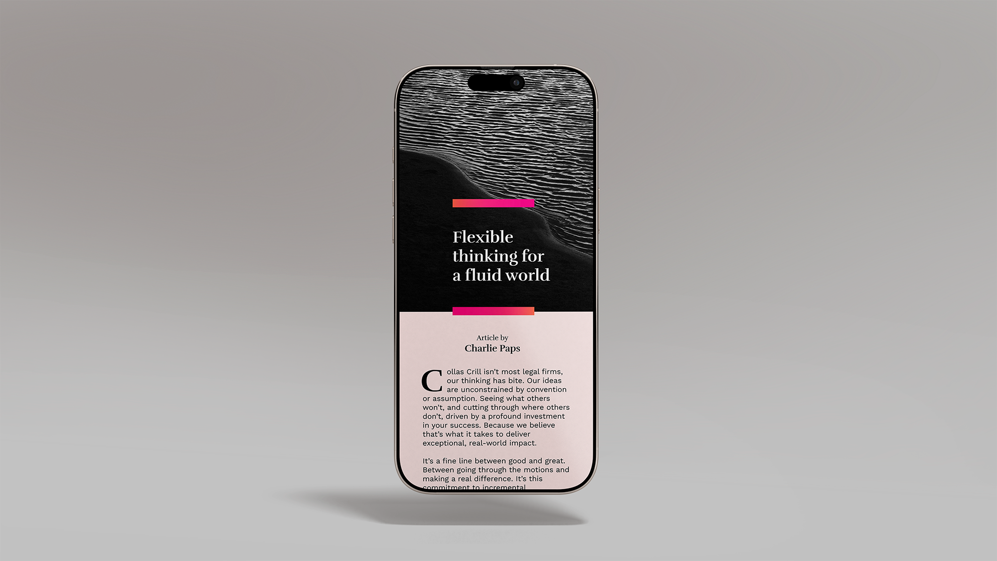
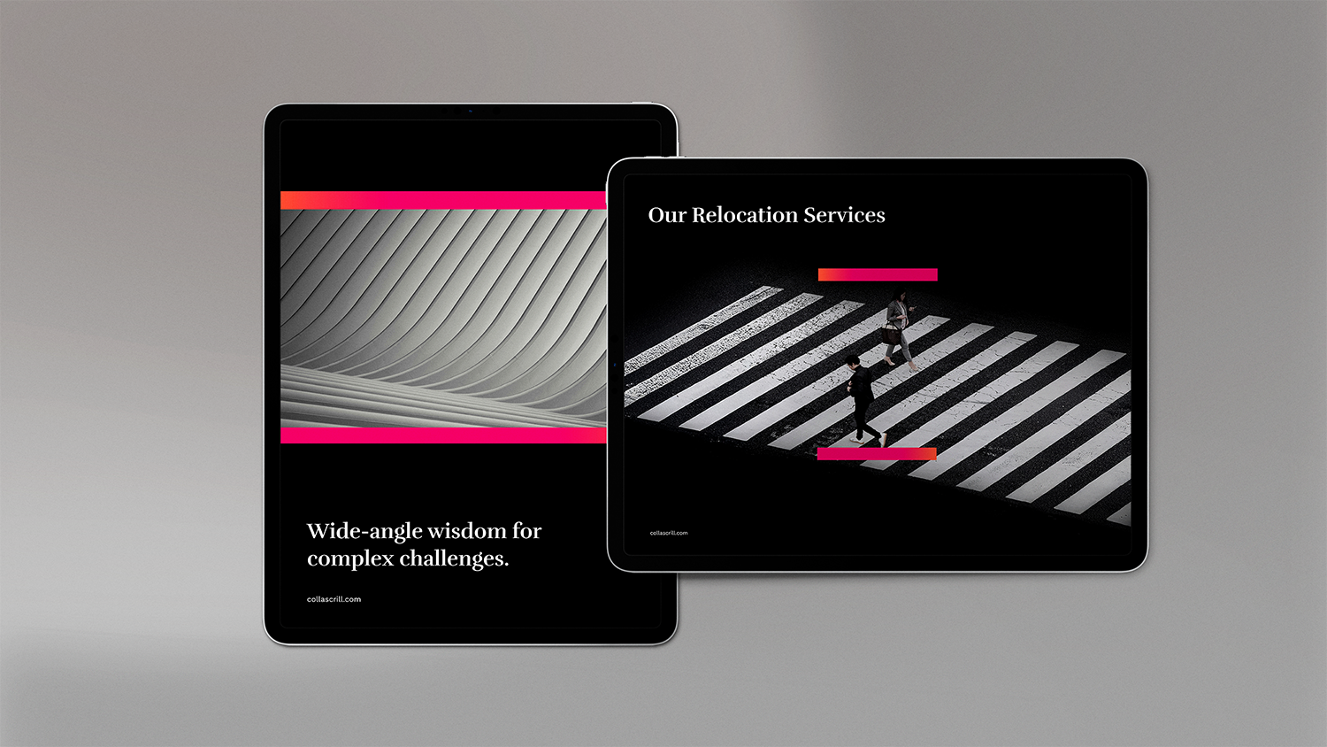
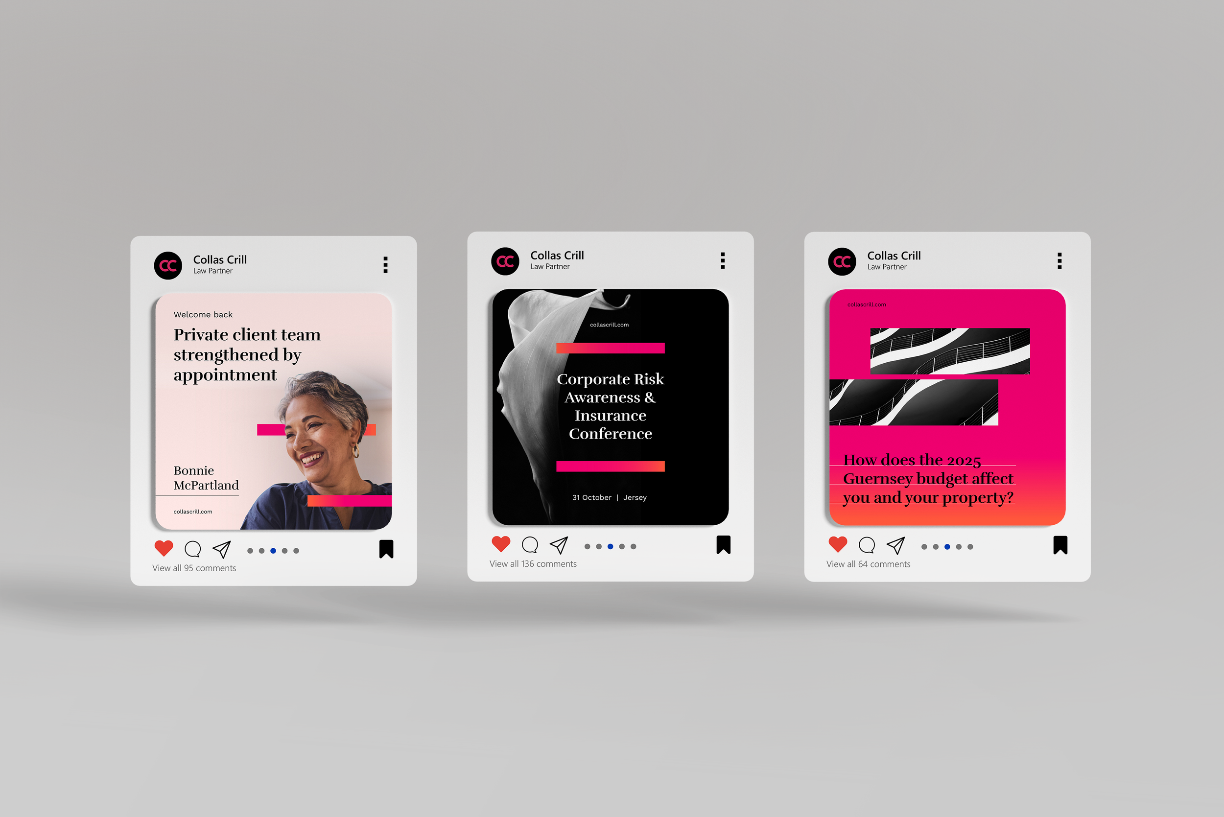
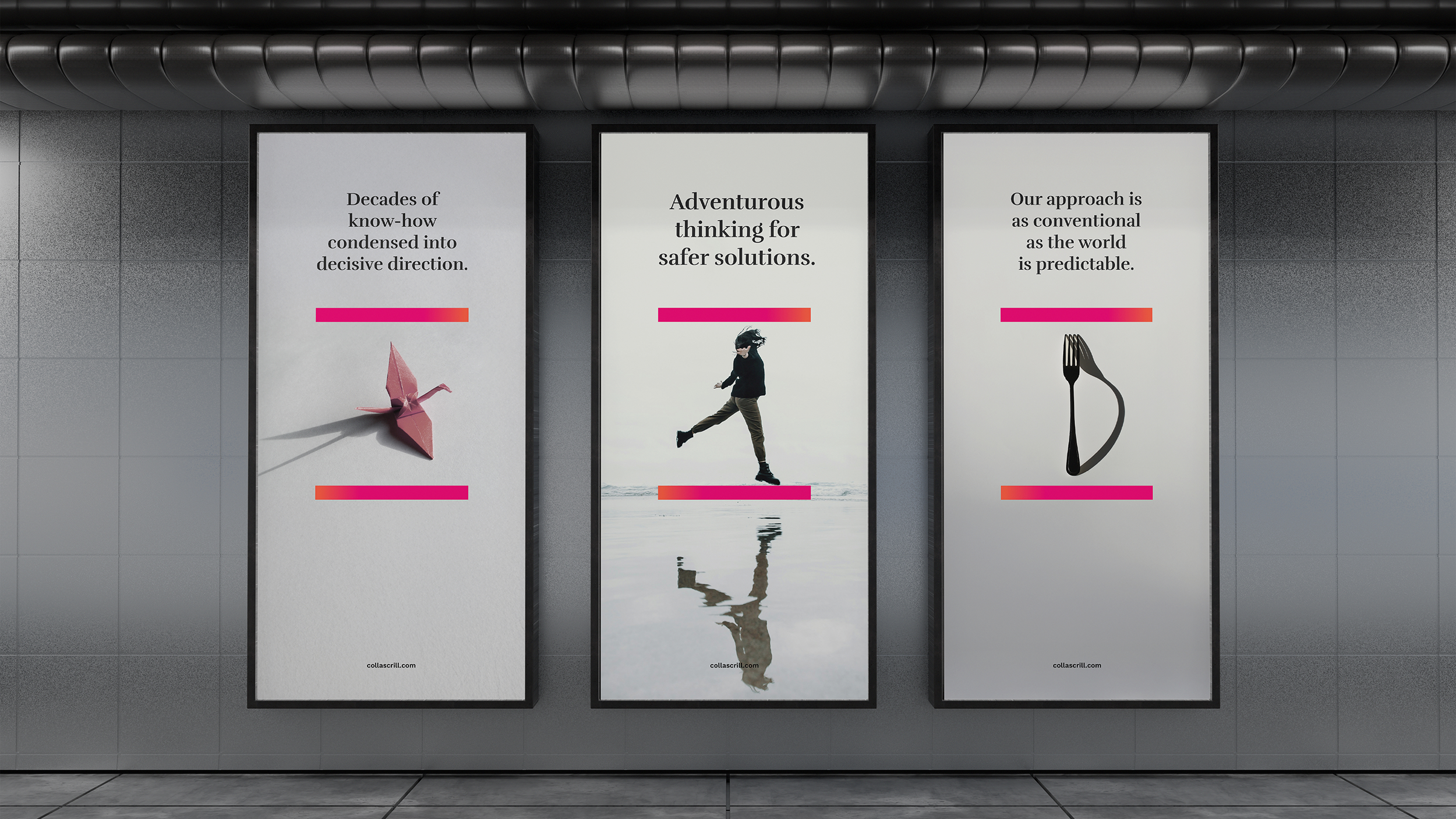
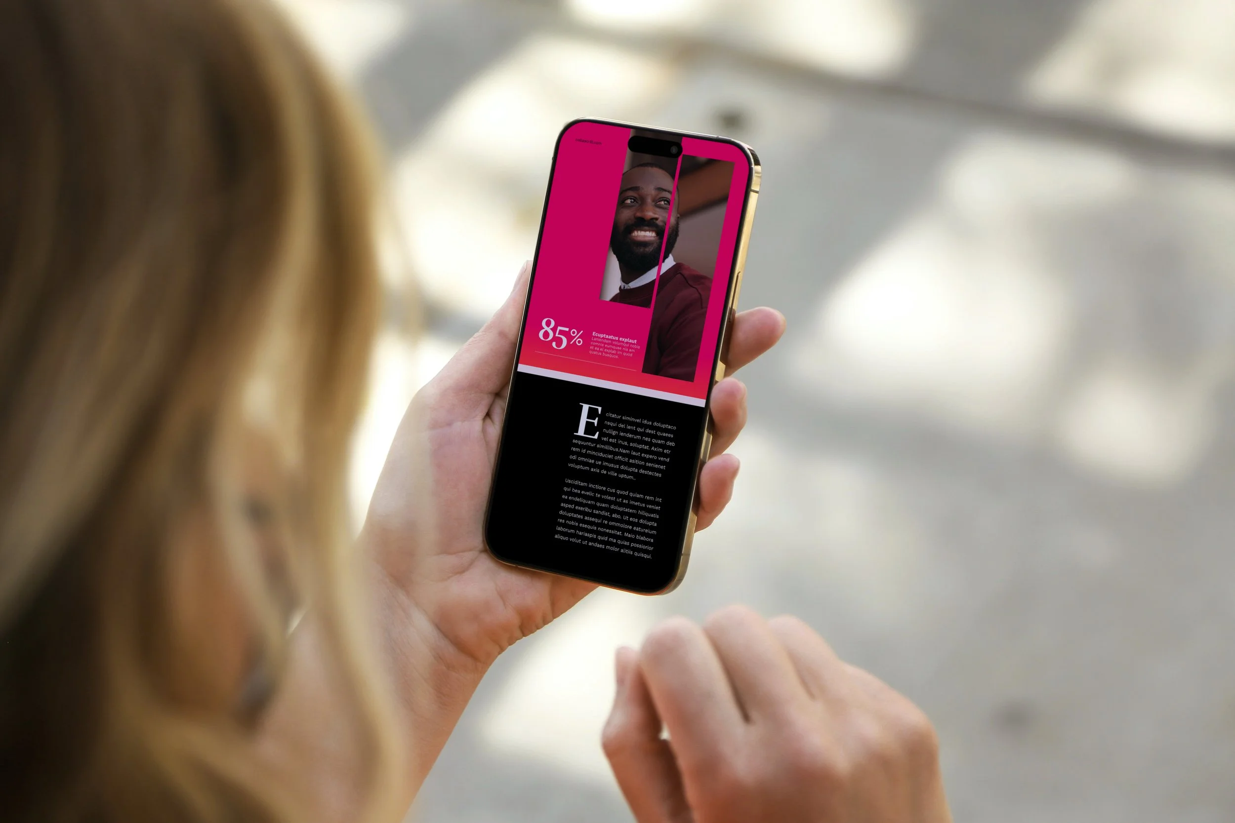
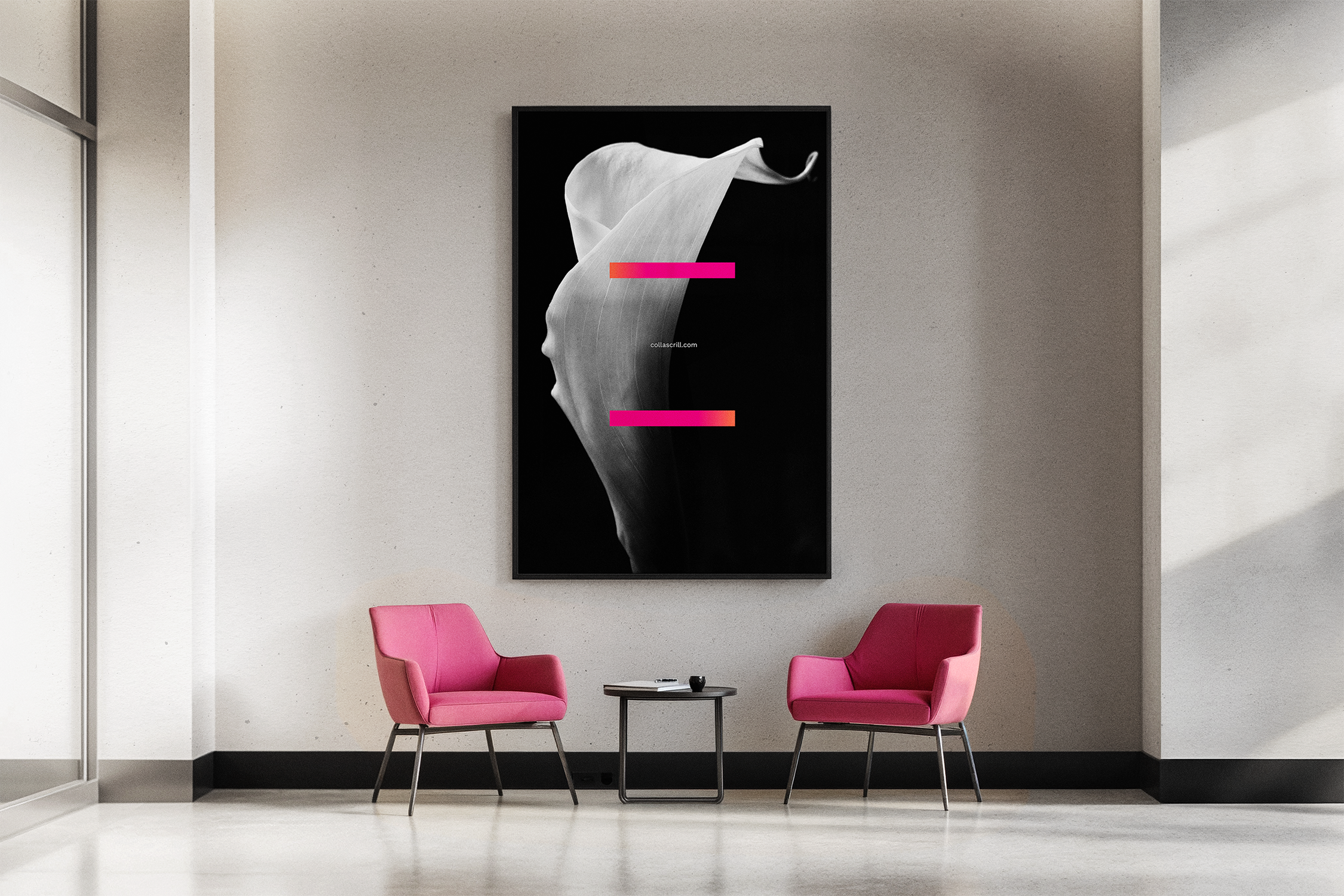
The identity is built around a simple but purposeful device: two fine lines and the margin between them. This margin of difference became a flexible framework that could be used to frame photography, hold content, highlight key messages and draw attention to detail — acting as a quiet symbol of partnership and precision.
Typography was refreshed to introduce warmth, confidence and character while remaining professional and legible. The colour palette was evolved rather than replaced, with the Collas Crill pink reinvigorated through a subtle coral gradient, adding depth and a more contemporary, fresh feel without losing recognition.
Together, these elements form an elegant and consistent system that brings clarity and cohesion across all brand touchpoints — from core collateral through to digital and campaign applications.
Outcome
The evolved identity gives Collas Crill a clearer, more confident presence that reflects both its expertise and its personality. The new system provides a bold yet understated way to express the brand — improving consistency, strengthening recognition, and creating a visual language that works across all brand touchpoints.
The result is a refined, purposeful identity that supports the firm’s way of working and allows it to show up with confidence, without trying to be something it’s not.