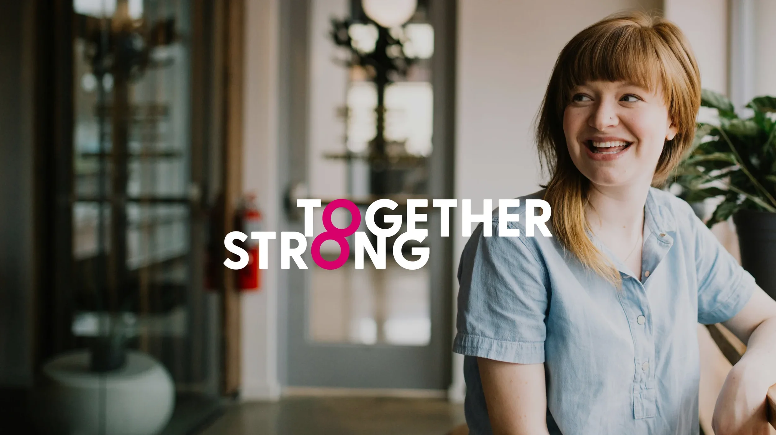
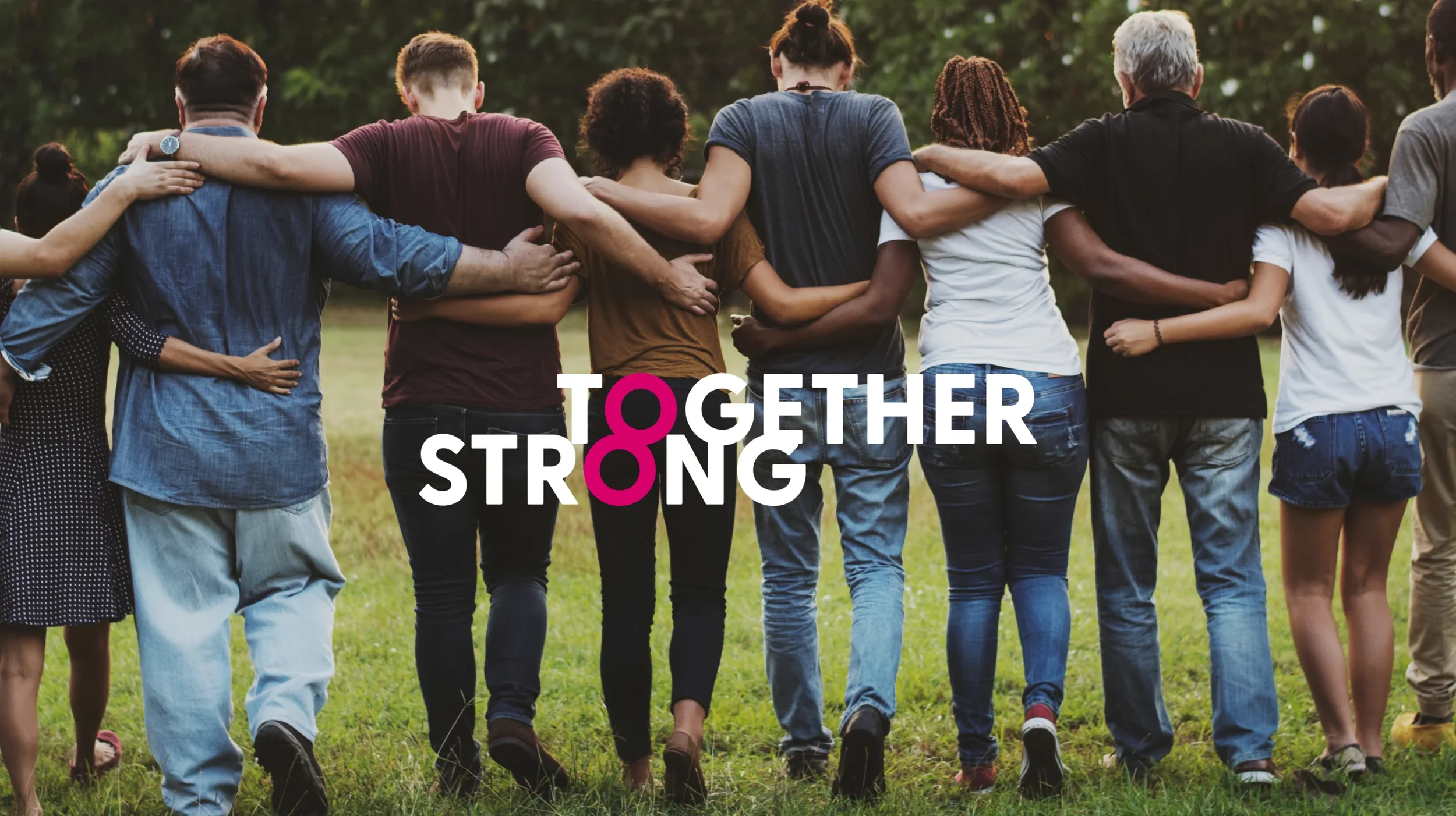
Together Strong
Cavernoma Society — Brand Identity & Campaign Toolkit
The Cavernoma Society is a UK charity supporting people affected by cavernoma — a rare neurological condition — along with their families, carers and wider community. I led the creative direction for a year-long rebrand, developing a clear, confident identity and campaign toolkit designed to amplify awareness, strengthen connection and support fundraising activity.
-
Design Director
-
Brand strategy · Identity system · Campaign toolkit · Visual language
-
2024
The Starting point
Cavernoma is a condition that is often misunderstood and underrepresented. The charity needed a brand identity that could help it be seen and heard — increasing awareness while remaining sensitive to the experiences of those living with the condition.
The work needed to support a wide range of audiences, from individuals and families to volunteers, healthcare professionals and donors. It also needed to function across multiple touchpoints, from digital campaigns and fundraising materials to events and community-led communications.
The Thinking — Together Strong
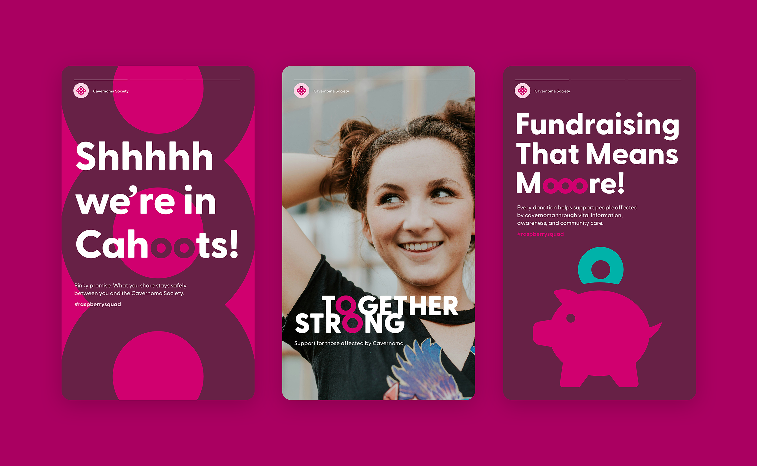
The organising idea, Together Strong, emerged from the strength of the Cavernoma community itself — shared experience, support and connection.
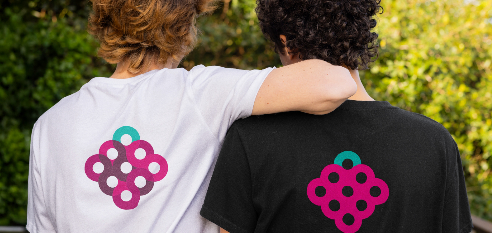
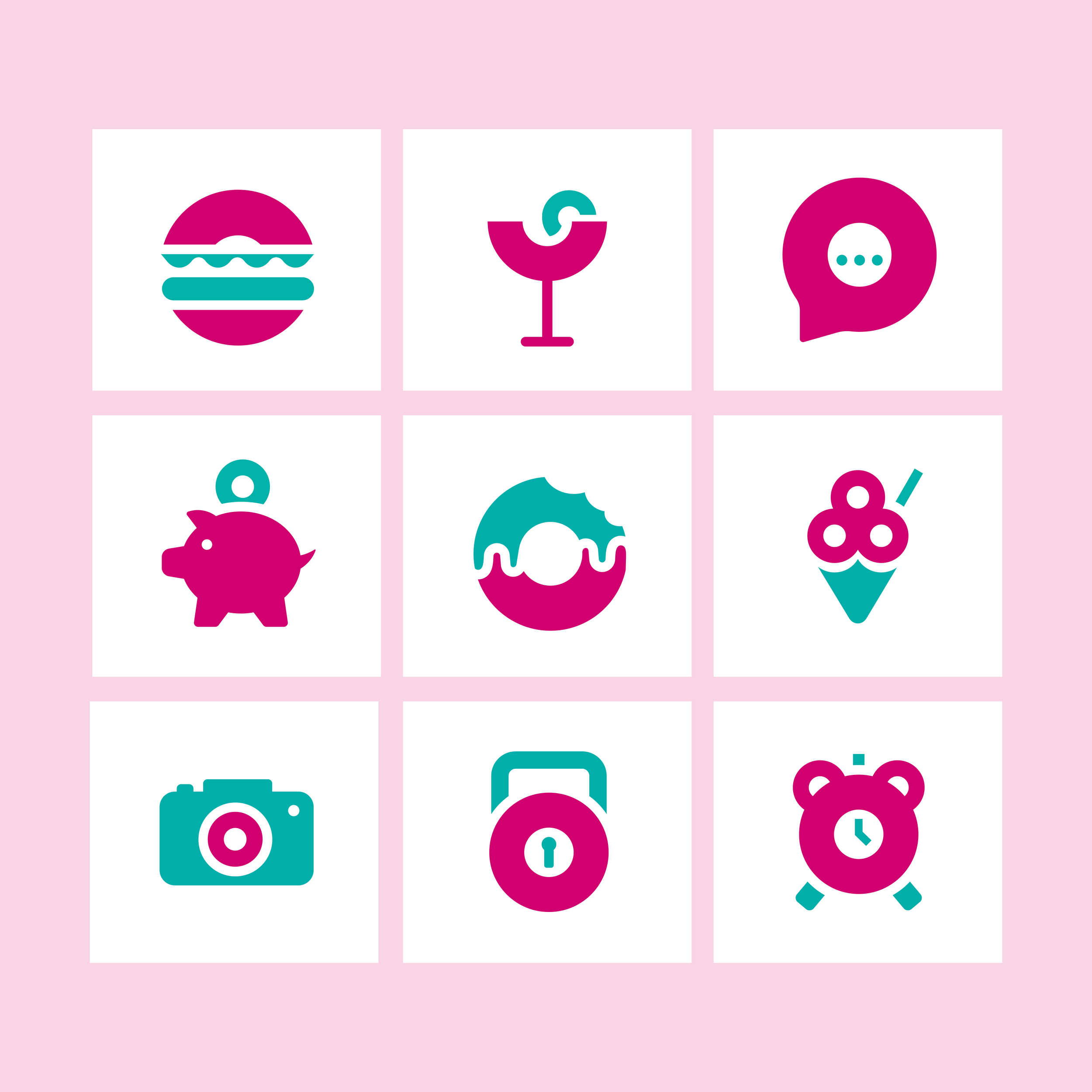
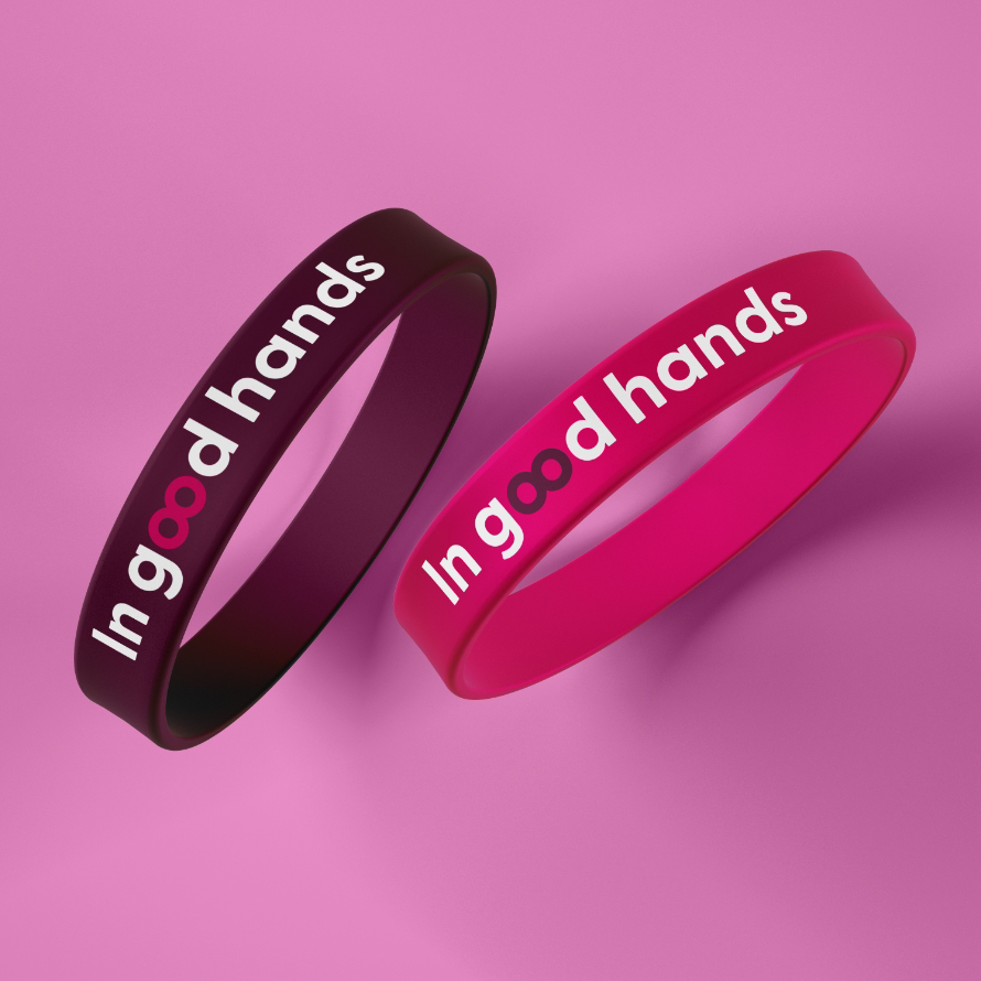
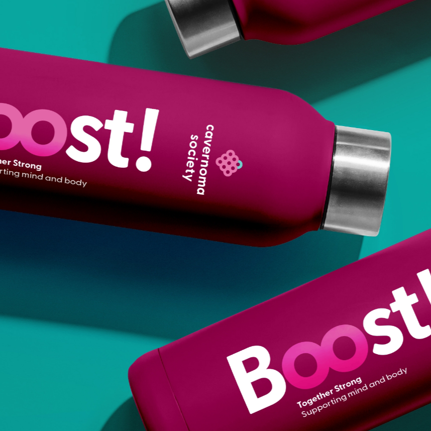
At the heart of the identity is the letter ‘O’, used as the foundational building block of the system. The form of the ‘O’ was chosen for its simplicity, inclusivity and symbolism. By grouping and clustering ‘O’ shapes, the system subtly alludes to the nature of a cavernoma — a cluster — without ever being literal or clinical.
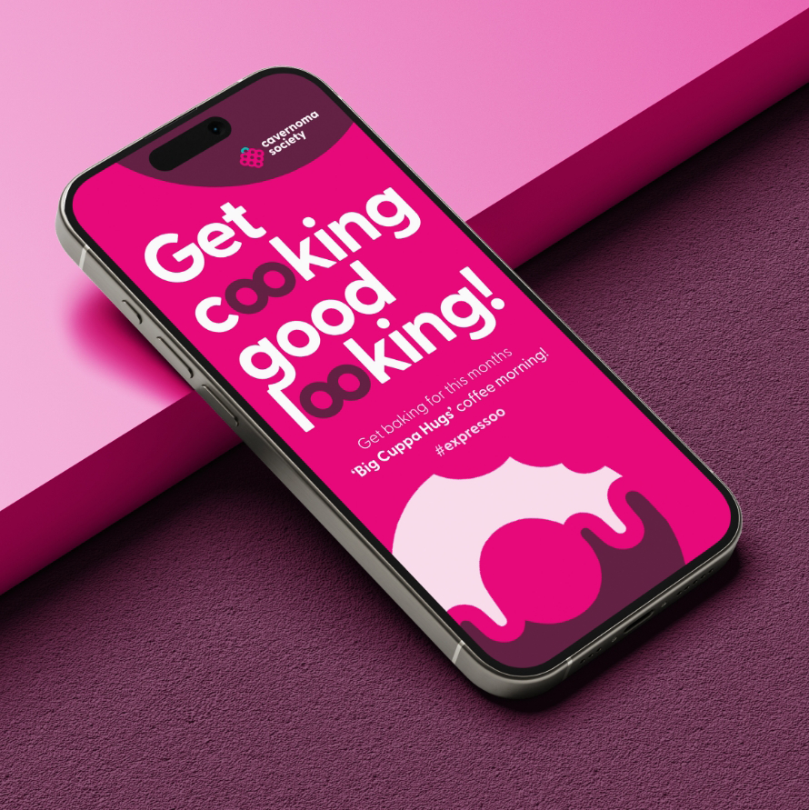
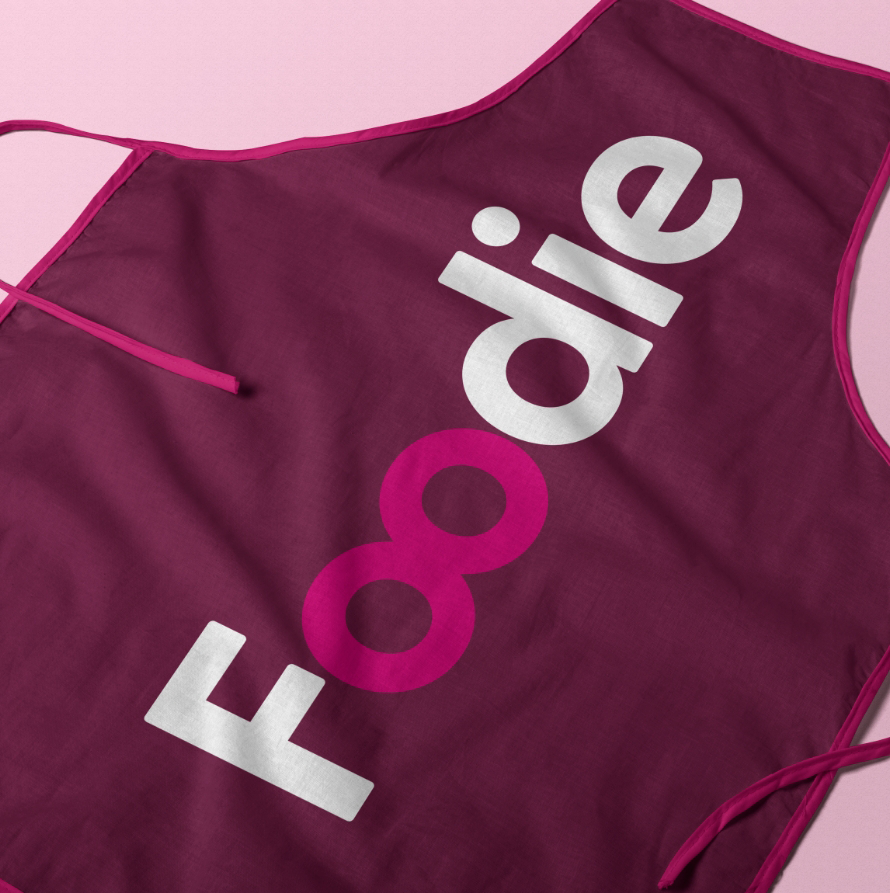
This same principle carries through the typography, where paired ‘O’s are used deliberately within language, reinforcing the idea of togetherness and connection. Importantly, this device is only used with positive, hopeful words, ensuring the tone of the brand remains uplifting and human.
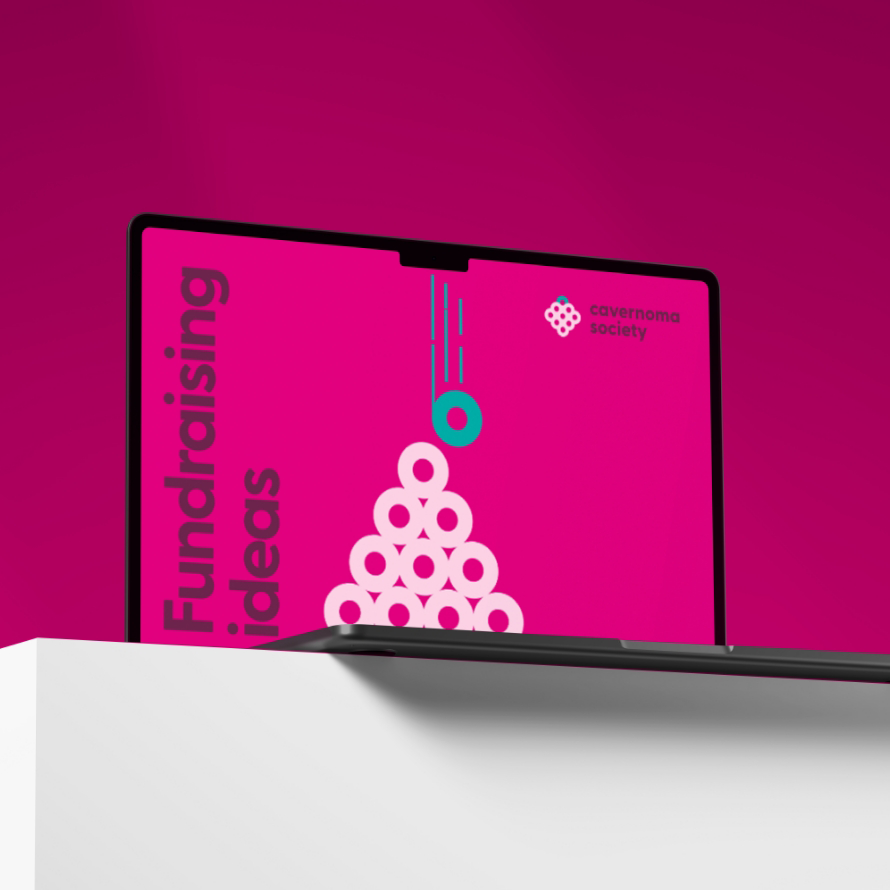
A campaign-led identity system
The ‘O’ becomes the foundation for everything — from the logo and iconography to graphic patterns and layouts. This creates a system that feels cohesive, recognisable and flexible, while remaining easy to use for a small internal team and volunteers.
The visual language balances clarity and warmth, supporting both emotional storytelling and clear calls to action. A bold colour palette, centred around the raspberry — a widely recognised awareness symbol — helps the brand stand out across digital, print and large-format applications, from social campaigns to outdoor placements.
Outcome
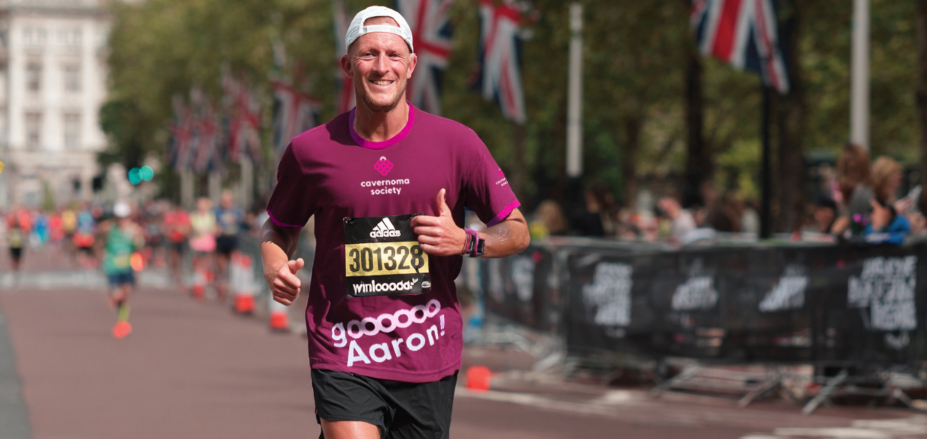
The new identity provided the Cavernoma Society with a stronger, more visible platform to communicate its work and engage its community. It supported the rollout of high-impact awareness campaigns, including Raspberry Day, and helped unify communications across channels.
The result is a brand that feels confident, connected and human — enabling the organisation to show up with clarity while amplifying the voices of those it represents.